Complete series source code can be downloaded from GitHub.
Introduction
In our last Journey to Station 4, we discovered the basics of creating our first Angular application.
Trust me. The real fun begins now. From this article, we will start learning Angular step by step. It’s going to be very different from how we learned ES6 and TypeScript.
We won’t learn Angular by talking about every concept one after the other. Instead, we will get into some real-time work. We create a couple of labs, and every lab will introduce some new angular concepts and new challenges. Every completing lab will take you to the next Station in your journey. You will not even realize when you reached to end, and you became an Angular developer.
Complete series (Index)
— — — — — — — — — — — — — — — — — — — — — — — — — —— — —

 https://www.amazon.in/Journey-Angular-Development-Sukesh-Marla/dp/9391030149
— — — — — — — — — — — — — — — — — — — — — — — — — — —
Lab 1 – Fundamental Angular Application
What are we going to create?
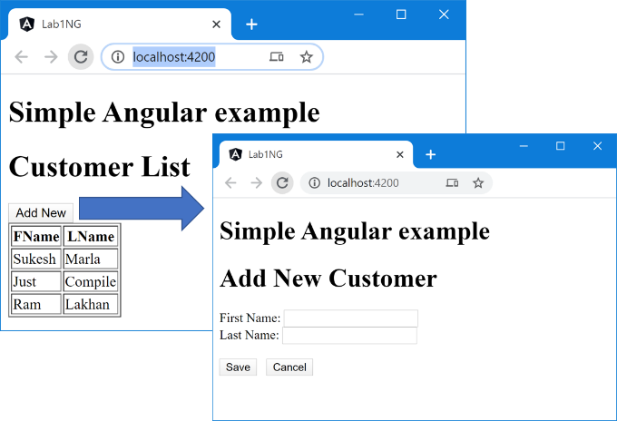
We will be creating a basic Angular application that will display a set of in-memory records in an HTML table with a provision to add a new one.
Start the lab
Step 1 – Create an Angular project
Use ng and create a new Angular Project lab1-ng as follows.
ng new lab1-ng
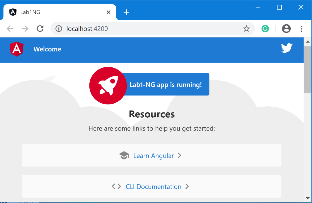
Step 2 – Check the App
Execute the following command to confirm that everything is as per expectation.
ng serve --open
Discussion
The above project contains AppModule, which is our Angular root module, and AppComponent, which is our Angular root component.
Let’s have some bullet points about Components. 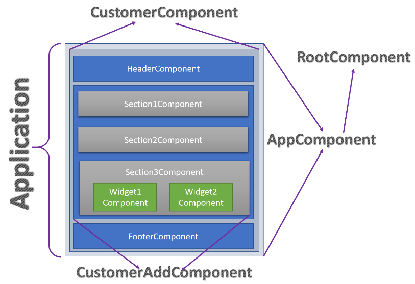
- Components are basic building blocks of an Angular application. The entire Angular application is a combination of reusable and compostable web components.
- The first component, which serves as a container for all other future ones, is called the root component. By convention, it’s named as AppComponent.
- Creating components is equivalent to teaching your browser about new HTML tags. By building it, you will be making a new HTML element.
Throughout this book, we will be creating a lot of components. So trust me when I say, “by the end of this book, you will become master of Component oriented design.”
Don’t worry about the Angular modules as of now.
Lab – Continued
Step 3 – Create a new Component
Inside the app folder, create a new folder called Customer.
Now inside that folder, create a TypeScript file customer.component.ts with the following contents.
import { Component } from '@angular/core';

@Component({

  selector: 'customer',

  templateUrl: './customer.component.html'

})

export class CustomerComponent {

}
Discussion – Continued
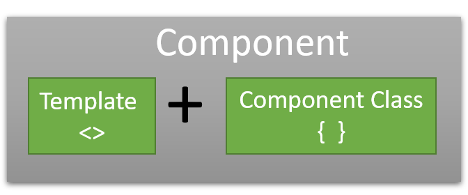
CustomerComponent class created in the above step is referred to as Component class or Template class. It is connected to a template file using the templateUrl property. Both of them together make the Angular Component.
There are three points worth discussing.
- You may ask, “Why folder?” We created our component inside the Customer folder. Keeping components inside in an independent folder is an industry-standard.
- Secondly, you must have noticed component.ts in the class file name and component.html in the template file name. You may ask, is it a must?
Once again, it’s just a practice followed in the industry.
.ts and .html are there because it is the extension and .component to identify that that file contains the component.
Please note that it’s not a strict rule. You can name your file anything you wish. - templateUrl is not the only way to attach the template to the component class. Sometimes you may find template instead of templateUrl. If your HTML is simple, you can use the template instead of templateUrl to reduce the overhead of creating another HTML file and connecting both.
In real-time, for most of the scenarios, we always have templateUrl.
Lab – Continued
Step 4 – Template file
Create a file customer.component.html inside the Customer folder with the following contents.
<h1>Hello From Customer.</h1>
Step 5 – Use the Component
Open app.component.html and use the CustomerComponent as below.
<h1>Simple Angular example</h1>
<customer></customer>
Step 6 – Check the output
Switch back to the browser and check the output.
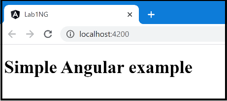
Aren’t we supposed to get some different output?
What do you think? What would have happened?
Before moving to the next step, I suggest give yourself some time and think about the reason.

Step 7 – Check the error
Switch to your command prompt to check the error.
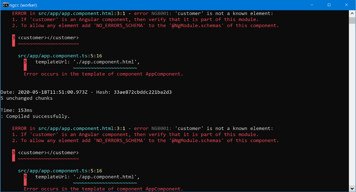
Discussion – Continued
Every component in Angular belongs to some Angular module. A component will be unusable if it is not part of any Angular module, and we will get “is not a known element error.”
To add a component to the module, we have to mention that component in the module’s declaration section.
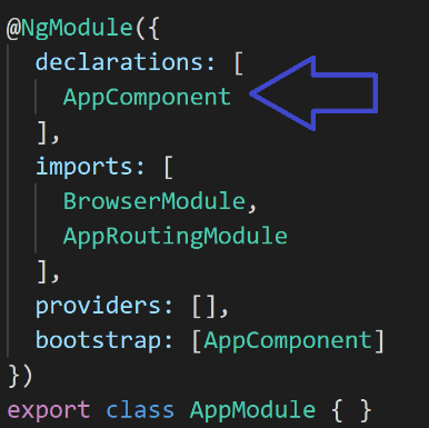
Please be careful with the declaration and bootstrap. In the bootstrap section, only root level components will be mentioned, whereas, in the declarations section, every component will be declared.
Please don’t worry about having multiple Angular modules in the system for now. We will discuss that later.
Lab – Continued
Step 8 – Add Component to Module
Open app.module.ts and add CustomerComponent in the declaration section.
......

import { AppComponent } from './app.component';

import { CustomerComponent } from './Customer/customer.component';

@NgModule({

  declarations: [

    AppComponent,CustomerComponent

  ],

......
Step 9 – Check the output.
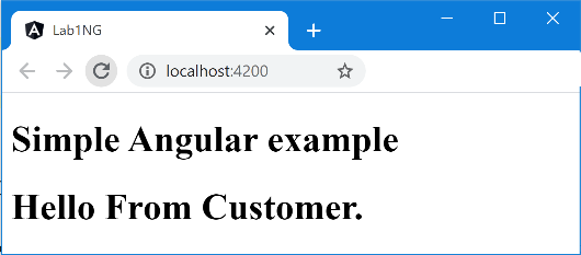 Switch to the browser and look at the output.
Now that we have a fundamental component in place let’s transform it to looks like our requirement. Let’s start with the dynamic table.
Step 10 – Create Model
Create a folder called Models inside the app folder and then create a file customer.ts with the following content.
export class Customer{

  constructor(public FName:string, public LName:string) {

  }

}
Discussion – Continued
Model is a standard naming we follow to represent the viewdata – data needed in the template or UI. We have not done anything special in the last step. It was a simple folder and simple class.
Step 11 – Populate Model
In the component class of the CustomerComponent, create a variable of type Array of Customer and then populate with some dummy values in the class constructor.
......

export class CustomerComponent {

    Customers:Array<Customer>;

    constructor() {

      this.Customers=new Array<Customer>();

      this.Customers.push(new Customer("Sukesh","Marla"));

      this.Customers.push(new Customer("Just","Compile"));

      this.Customers.push(new Customer("Ram","Lakhan"));

    }

......
Discussion – Continued
Now it’s time to introduce Interpolation. It’s an Angular feature using which we can display dynamic contents in the templates. We have to put an expression between {{ and }}, and it will be evaluated and rendered. We will see it in action in the next step.
Lab – Continued
Step 12 – Display dynamic content in the template
Open customer.component.html and replace contents with the below contents.
<h1>Displaying Single Customer</h1>

<hr>

First Name: {{Customers[0].FName}}<br>

Last Name: {{Customers[0].LName}}
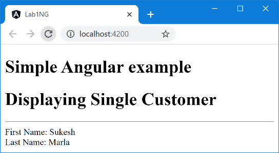
Step 13 – Check the output
See what you have in the browser.
We have successfully displayed the first Customer from the collection dynamically. Is that our requirement? I think no.😉
We require to display the entire Customer collection.
Discussion – Continued
It’s time for Directives.
A Directive is an Angular concept which extends our HTML.
There are three kinds of directives.
- Component Directives
You have already seen it. AppComponent and CustomerComponent are component directives, also called as components. Creating them is like creating a new HTML tag. - Attribute Directives
The name itself says what it is. It’s an attribute. We attach it to other HTML elements or Angular components, and its default behavior will get change. - Structural Directives
They are attributes too, but like attribute directives, they won’t change the HTML element or Angular component’s default behavior. Instead, they will change the default structure of that element.
Throughout this book, we will see all three directives in action, including our custom ones.
For now, let’s look into *ngFor. Don’t miss that *.
* is an indication that its a structural directive. We attach it to an element, and its structure will change. Let’s understand it with the demo.
Lab – Continued
Step 14 – Display array
Change the contents of the Customer template to the following code.
<h1>Customer List</h1>

<table  border="1">

  <tr>

    <th>FName</th>

    <th>LName</th>

  </tr>

  <tr *ngFor="let item of Customers">

    <td>{{item.FName}}</td>

    <td>{{item.LName}}</td>

  </tr>

</table>
Step 15 – Check the output
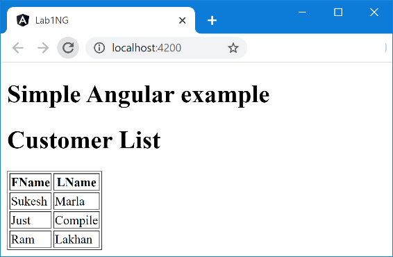
Discussion – Continued
*ngFor
As you know, tr represents a single HTML row, but because we have attached the *ngFor directive to it, its structure got changed. Instead of one row, we got three rows as the collection had three elements.
Look at the expression assigned to *ngFor.
That is let item of customers
item will hold the individual Customer object and will act as data to the particular row. Its values can be displayed dynamically using Interpolation.
I request you to play with this demo a little bit more before reading further.
Angular Module
If you remember, earlier, we discussed something about Angular Module. Every Component in Angular is part of some Angular Module. The same applies to the Directives.
You already know the basic concept of the module in general.
Anything defined inside one module will be private to that particular module and won’t be accessible in any other Module. We have to import and export it explicitly, in case we want to make anything available. We have seen it in the ES6 chapter.
The angular module shares a similar attitude. Directives and Components defined as part of one module will not be accessible in any other Module until that one module explicitly exports it, and the other one imports it.
I believe you must have realized the point by now. Inside which Angular Module “*ngFor” directive is defined, and how was it available to use inside “CustomerComponent”?
The answer is, it’s possible as “CustomerComponent” is defined inside AppModule, and AppModule is importing “BrowserModule,” which exports “*ngFor.”
Note: When I said, BrowserModule exported *ngFor,” you must have got an impression that *ngFor” is defined as part of BrowserModule just like “CustomerComponent” is defined as part of “AppModule.” Surprisingly that is not true. Indeed BrowserModule exports “*ngFor” but “*ngFor” is not part of BrowserModule.
You will get to know more about this concept very soon.
Lab – Continued
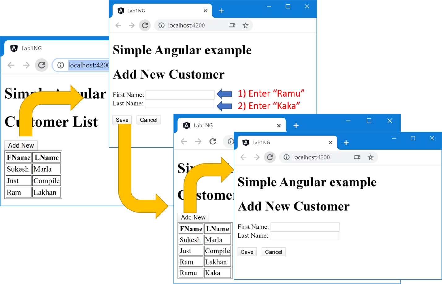
Step 16 – Create the Form
We are halfway through our final UI.
Let’s start by putting up the Form in the UI.
Keep existing code in the “customer.component.html” as it is. Just adds the following code in the end.
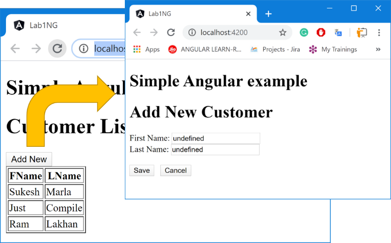
...... </table> <div> <h1>Add New Customer</h1> First Name: <input type="text" name="FName"><br> Last Name: <input type="text" name="LName"><br><br> <input type="button" value="Save" (click)="Save()"> <input type="button" value="Cancel" > </div>
Step 17 – Check the output

Discussion – Continued
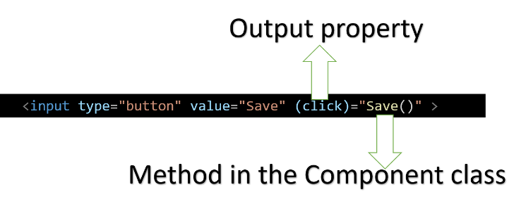 It’s time to bring “Event binding” in action.
Using it, we can bind the event of control in the template to a method in the Component class.
Event binding also introduces a concept, “output property.”
In the above image, can you see “click” written within parenthesis?
“click” is an output property of “input,” and it is assigned to “save()” where “save” is a method defined in the Component class, and this entire concept is called “event binding.”
Lab – Continued
Step 18 – Add new Customer
Handle the “click” event of the “save” button in our Customer template as follows.
........ First Name: <input type="text" name="FName"><br> Last Name: <input type="text" name="LName"><br> <input type="button" value="Save" (click)="Save()"> <input type="button" value="Cancel" >
Now, let’s define the “save” function in our Component class as follows.
......

    Save(){

      this.Customers.push(new Customer("Karan","Arjun"));

    }

}
Don’t worry about hard-coded values for now. Later we will make it dynamic.
Discussion – Continued
In Angular, all DOM events such as click, focus, etc. are internally overridden. At the end of these events, Angular fire “Change Detection,” which re-render the component based on the new state of the UI. State means purely properties defined in the Component class.
As of now, don’t worry much about “Change Detection” for now. We have a detailed discussion of the same in the future.
Lab – Continued
Step 19 – Check the output
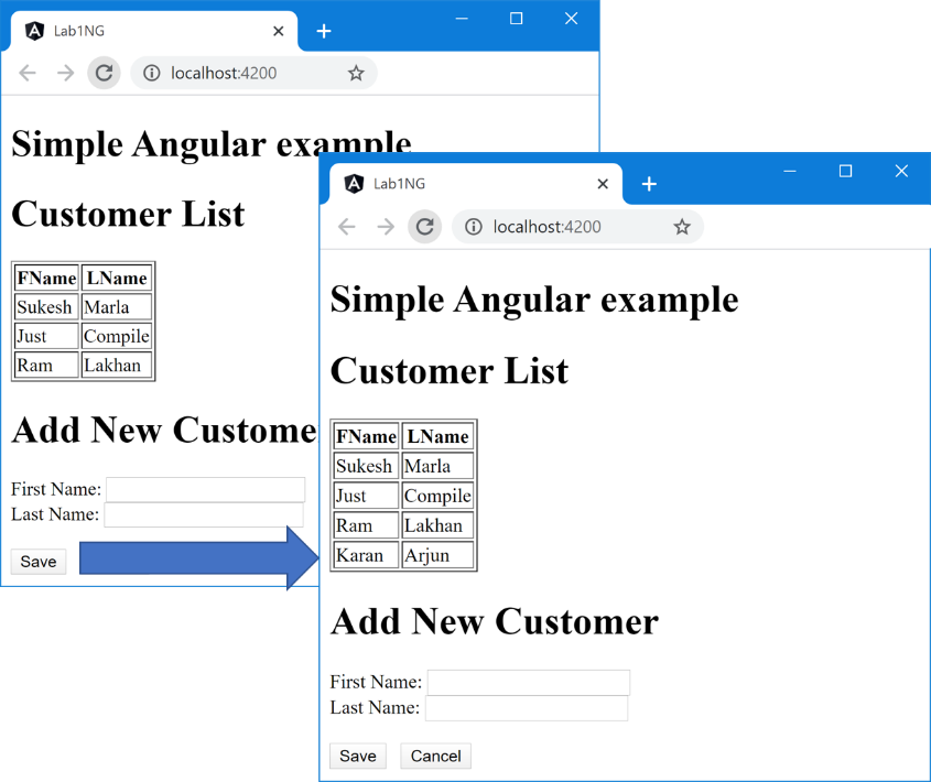
As you can see, because of “Change Detection,” we are getting updated UI after button click.
Discussion – Continued
Let’s point down the requirements that are pending.
- Only one of the two sections will be displayed at a time – either data-entry screen or dynamic table.
- A new Customer is supposed to be created based on the values in the textbox.
- Textbox values have to be validated with some rules.
For implementing the first requirement, we will use an Angular concept called “Property binding.” Using it, we can create a binding between the property of a Component and a Component class.
Property binding also introduces a concept, “input property.”
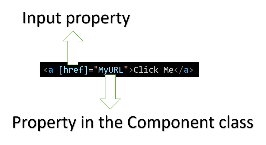
In the above image, can you see “href” written within square brackets?
“href” is an input property of “a” element. It is assigned to “MyURL” where “MyURL” is a property defined in the Component class, and this concept is called “property binding.”
Have confusion between Property binding and Interpolation?
If yes, then relax. We will discuss it very soon.
Lab – Continued
Step 20 – Setup Component class for dynamic visibility
In the CustomerComponent class, create a new Boolean property “IsAddNew” and assign it to “false” in the constructor.
......

    Customers:Array<Customer>;

    IsAddNew:boolean;

    constructor() {

      this.IsAddNew=false;

      this.Customers=new Array<Customer>();

......
Step 21 – Implement Property Binding in the Template
Add an HTML container element “div” around the table and attach the “hidden” attribute to it.
<div [hidden]="IsAddNew">

  <h1>Customer List</h1>

  .......

</div>

......
Note: “hidden” is an HTML attribute that is used to hide an element.
When the “list div” is hidden, the “data-entry div” should be visible and vice versa.
So, attach the hidden property to “data-entry div” as follows.
......

<div [hidden]="!IsAddNew">

First Name: <input type="text" name="FName"><br>

  Last Name: <input type="text" name="LName"><br>

......

</div>
Step 22 – Check the output
Go back to the browser and check the output.

As you can see, the “data-entry div” is invisible now.
Step 23 – Implement “AddNew”
Now, add the “AddNew” button in the “list div” and handle the “click” event as follows.
<div [hidden]="IsAddNew">

  <h1>Customer List</h1>

  <input type="button" value="Add New" (click)="AddNew()">

  <table  border="1" >

......
......

    Save(){

      this.Customers.push(new Customer("Karan","Arjun"));

    }

    AddNew(){

      this.IsAddNew=true;

    }

}
Step 24 – Check the output
The “Cancel” button code will be an assignment for you.
Discussion – Continued
Property binding and Interpolation both support one-way binding. Every-time the value of the variable is changed, the control value gets changed.
But what’s the difference between them?
First of all, I strongly recommend you change the above code from Property binding to Interpolation and check the output. Once you are done, continue reading.

I am sure that It is not working. No matter what is the value of “IsAddNew” is, you must have noticed “data-entry div” being invisible all the time.
First of all, let me make one thing very clear to you. Interpolation gets converted to Property binding in the behind.
The great thing about Interpolation is, it makes binding simpler. For instance, let’s say we have the variable “CompanyName” in our Component class, and we want to display “CompanyName” concatenated with “Hello, the company name is” as a value of a read-only textbox.
With property binding, the syntax will be as follows.
<input type="text" [value]= "'Hello, the company name is' + CompanyName" />
Now, the same code can be written with Interpolation as follows.
<input type="text" value="Hello, the company name is {{CompanyName}}" />
You can easily say that with Interpolation, it becomes easy. So, when the value type is a string, Interpolation is preferred as concatenation is very easy.
On the other hand, if the value type is non-string, then input property is preferred as Interpolation interprets everything as a string.
You will get better clarity once you see custom input and output properties in action.
Lab – Continued
Step 25 – Connect Component properties to Form controls
First, In the Component class, create two properties.
......

    FirstName:string;

    LastName:string;

    constructor() {

.....
Next, modify controls in the template file as follows.
...... <h1>Add New Customer</h1> First Name: <input type="text" name="FName" (change)="ChangeFirstName($event.target.value)"> <br> Last Name: <input type="text" name="LName" (change)="ChangeLastName($event.target.value)"> <br><br> <input type="button" value="Save" (click)="Save()"> ......
Next, define “ChangeFirstName” and “ChangeLastName” in Component class as follows.
    ChangeFirstName(value){

      this.FirstName=value;

    }

    ChangeLastName(value){

      this.LastName=value;

    }

}
In the above code, “$event.target” represents the control, which triggered the event, and that is the corresponding textbox.
Now at any point in time in the Component class, “FirstName” and “LastName” hold the latest state of the respective control. We can call it “reverse one-way binding.” Every-time textbox value is changed, variables get updated.
Step 26 – Modify Save for dynamic values
......

    Save(){

      this.Customers.push(new Customer(this.FirstName,this.LastName));

    }

    AddNew(){

......
Step 27 – Check the output
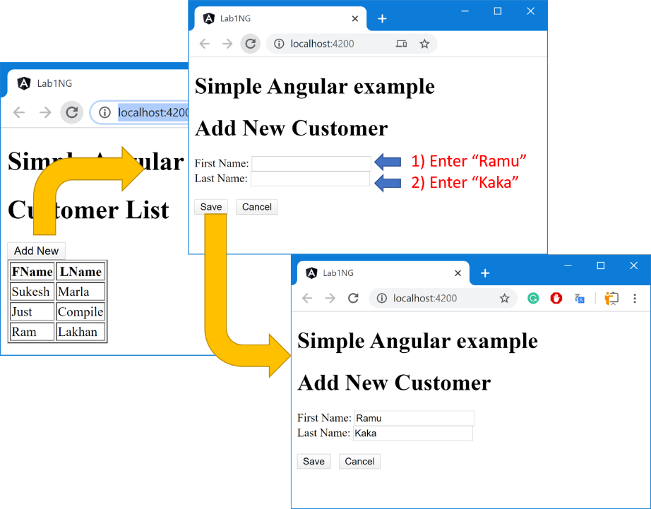
I don’t think it was the output you were expecting. You might be in the impression that after the “save” click, the Customer list will get displayed again with the new row, but sadly it didn’t.
Don’t read the next step. Instead, spend some time and try to realize the reason for the same.

Step 28 – Make it right
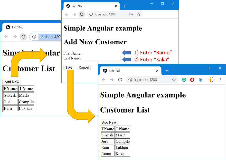
Are you able to figure out the reason for this bug? It was “IsAddNew.” Its value is still “true.” Hence view didn’t get change.
Change the “Save” function to the following.
......

    Save(){

      this.Customers.push(new Customer(this.FirstName,this.LastName));

      this.IsAddNew=false;

    }

    AddNew(){

......
Step 29 – Check the output.
Discussion – Continued
I believe you were able to finish the “Cancel” functionality on your own.
If you examine whatever we have created so far, you will find a small bug. Follow the below steps.
- Click “Add New.”
- Enter some values in the controls.
- Click “Save” or “Cancel.”
- Now again, click “Add New.”
You will notice original values in control. They are supposed to reset to empty.
I believe you know how to achieve it. Think for a while and see if you can come up with a solution.

As you know, in one of the previous steps, we created “reverse one-way binding” between our variable and control, and you already know “one-way binding” using property binding. By using both of them together, we can achieve reset functionality.
Lab – Continued
Step 30 – Modify Template for Reset
Modify the contents in the template file as follows.
<h1>Add New Customer</h1> First Name: <input type="text" name="FName" [value]="this.FirstName" (change)="ChangeFirstName($event.target.value)"><br> Last Name: <input type="text" name="LName" [value]="this.LastName" (change)="ChangeLastName($event.target.value)"><br><br> <input type="button" value="Save" (click)="Save()">
Step 31- Modify Component class for Reset
Create the “Reset” function as follows and invoke them in the “Save” and “Cancel” method.
 Reset(){

      this.FirstName="";

      this.LastName=""

    }

    Save(){

      this.Customers.push(new Customer(this.FirstName,this.LastName));

      this.IsAddNew=false;

      this.Reset();

    }

    Cancel(){

      this.IsAddNew=false;

      this.Reset();

    }
Step 32 – Check the output
One more upsetting output. What happened? Let’s discuss this.
Discussion – Continued
By writing the below code, we created a property binding (one-way binding) between the “FirstName” textbox in the template and “FirstName” property in the Component class.
Because this whatever value “FirstName” variable contains the same will be displayed in the corresponding textbox. Whenever the value of property gets changed, the textbox value gets refreshed too.
The Same happening with LastName.
In the current scenario, both variables are unassigned initially. Hence the value is “undefined.”
Step 33 – Reset controls on init
Invoke the same “Reset” function in the constructor.
......

    constructor() {

      this.IsAddNew=false;

      this.Reset();

      this.Customers=new Array<Customer>();

......
Step 34 – Check the output

Discussion – Continued
In the above output, we have handled Form manually. Instead, we can let Angular do that for us.
There are two approaches in Angular with regards to forms.
- Template-driven approach
- Model-driven approach, aka Reactive approach
Following one of the approaches instead of manual makes our life a lot easier.
Let’s not get into too much theoretical explanation for understanding the difference between Template-driven and Model-driven. Instead of that, let sum it up with just one statement.
In the Template-driven approach, we will control the entire Form in the template file, and in the case of the Reactive approach, that happens in the Component class.
For this lab, we will be following the Template-driven approach. Later we will see Model-driven, and at that time, we will discuss the difference again.
The template-driven approach provides us with “ngModel,” which is a directive for implementing two-way binding.
Two-way binding is a binding methodology where UI and Model are connected in both directions.
The value of the Model will be displayed in UI. If anytime Model changes, UI gets that change, and if UI gets changed, Model gets that change.
[Image for Model to UI and UI to Model]
“ngModel” directive is defined inside the “FormsModule,” which is an Angular Module defined in the “@angular/forms” TypeScript Module.
In case we want to use “ngModel” in our component, then first, we need to import “FormsModule” in our AppModule.
Lab – Continued
Step 35 – Import FormsModule
Import “FormsModule” in the AppModule as follows.
......

import { CustomerComponent } from './Customer/customer.component';

import { FormsModule } from '@angular/forms';

@NgModule({

  declarations: [AppComponent, CustomerComponent],

  imports: [BrowserModule, FormsModule],

  providers: [],

......
Step 36 – Beautify class
Remove “ChangeFirstName” and “ChangeLastName” methods from Component class.
Also, remove the call to “Reset” function in the constructor.
- ngModel take care of binding control values to respective properties
- ngModel take care of “undefined.”
Step 37 – Implement “ngModel”
Change both text boxes in the template to the following.
...... <h1>Add New Customer</h1> First Name: <input type="text" name="FName" [(ngModel)]="this.FirstName"><br> Last Name: <input type="text" name="LName" [(ngModel)]="this.LastName"><br><br> <input type="button" value="Save" (click)="Save()"> ......
Step 38 – Check the output
You will get the same output as before.
Note: You must have got confused because of using both square and round brackets. Don’t worry about that. For now, just take it as a syntax. You will get through it by the end of this book.
Discussion – Continued
Next, we will implement validation. We will do it in two stages.
Stage 1 – We will put a red border around the control if validation is failed
Stage 2 – Display error message
To complete Stage 1, we will use CSS, and the best thing is “ngModel” dynamically applies CSS classes to controls based on condition. We just have to define those classes.
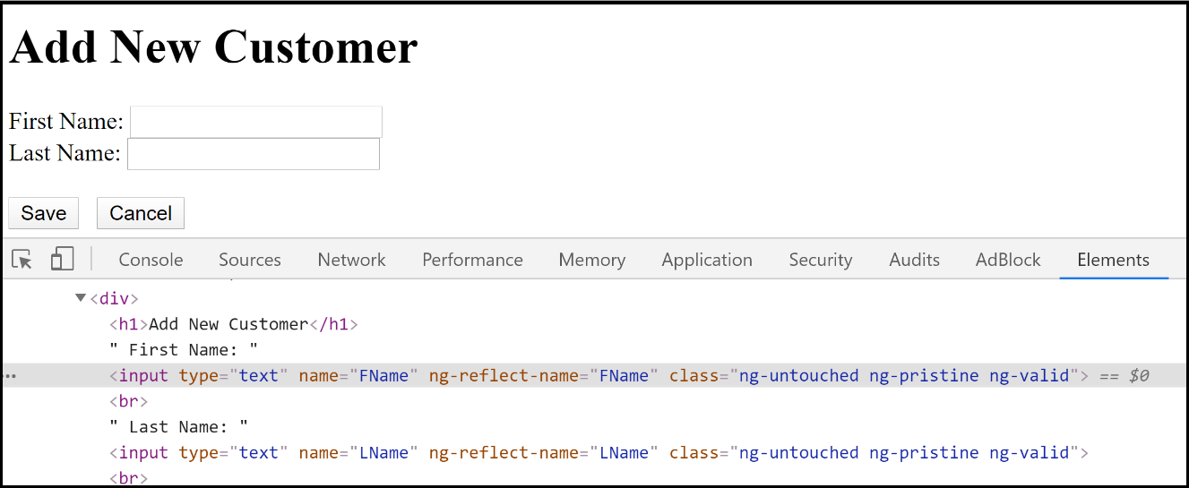
You can notice three CSS classes attached to control.
- “ng-untouched” – It means control is not touched yet. Put a cursor inside the textbox and focus out. “ng-untouched” will get changed to “ng-touched.” Once it is touched, it cannot be untouched.
- “ng-pristine” – It means control values are not modified. Try to change it to anything, and it will change to “ng-dirty.” Once it is dirty, it cannot be pristine again.
- “ng-valid” – It means control contains a valid value, and it will be changed “ng-invalid” when validation is failed. Unlike the other two, this one keeps switching between valid and invalid.
How to attach validation?
For that, we will use HTML attributes such as “required,” “minlength,” “pattern,” etc. We will look into custom validation in the later stage of the book.
Lab – Continued
Step 39 – Create CSS
Open “style.css” in the “src” folder and put the following contents.
.ng-invalid.ng-touched.ng-dirty{

  border: 1px solid red;

}
The above style says formatting will be attached to only those controls which will have all three CSS classes.
Step 40 – Attach validation to controls
Modify the content in the template as follows.
...... <div [hidden]="!IsAddNew"> <h1>Add New Customer</h1> First Name: <input type="text" name="FName" [(ngModel)]="this.FirstName" required minlength="3"><br> Last Name: <input type="text" name="LName" [(ngModel)]="this.LastName" required minlength="3"><br><br> <input type="button" value="Save" (click)="Save()"> <input type="button" value="Cancel" (click)="Cancel()" > </div> ......
As per the above code, both textboxes won’t accept empty values, and value must contain a minimum of 3 characters.
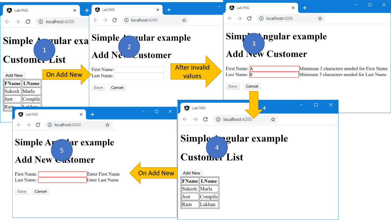
Step 41 – Check the output.
We have not completed validation entirely yet. So, for now, don’t click the “save” button.
Instead, just check the formatting and for that, try the following.
- Make sure that the border is not displayed in the beginning, as controls are not touched yet.
- Put a cursor in any textbox and focus out. The border should not be displayed as controls are not dirty yet.
- Put a cursor in any textbox, put some values with more than three-character, and focus out. The border should not be displayed as controls are valid.
- Put a cursor in any textbox, put some values with less than three-character or leave it empty, and focus out. The border should be displayed as controls are touched, dirty, and validation failed.
Discussion – Continued
Now that we are done with formatting controls for validation, its time to display error messages.
For that, we can use the properties exposed by the “ngModel” class.
As you know, “ngModel” is a directive, and conceptually it’s a “class.”
Every time we attach a directive to an element, one instance of that directive gets created and will be associated with that element. We can get the reference of that instance in our template using “template reference variables.”
For instance, look at the following code.
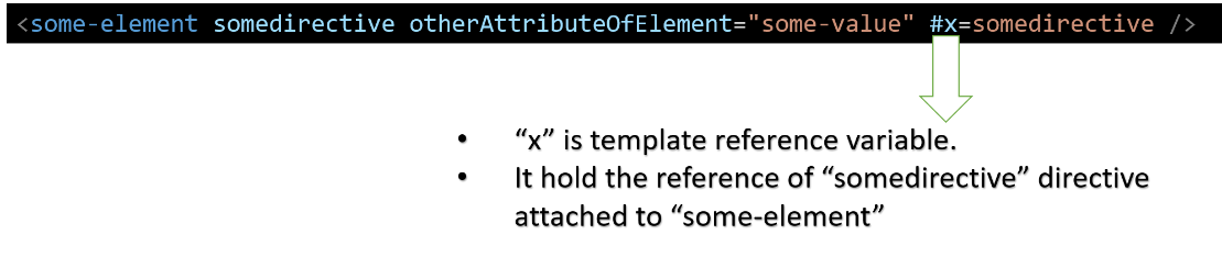
“ngModel” class instance will provide us seven properties using which we can control the appearance of our error message.
- “touched” – will be true if control is touched or else false.
- “untouched” – will be false if control is touched or else true.
- “pristine” – will be true if control’s value is not changed yet or else false.
- “dirty” – will be false if control’s value is not changed yet or else true.
- “valid” – will be true if the control’s value is valid or else false.
- “invalid” – will be false if the control’s value is valid or else true.
- “error”- will be null if the control’s value is valid, or else it will be an object with properties such as “required,” “minlength,” “pattern,” etc. Each of which will be again Boolean property indicating which validation failed.
Let’s do the demo and understand it.
Lab – Continued
Step 42- Attach validation message
Add error messages to both the control as follows.
<div [hidden]="!IsAddNew"> <h1>Add New Customer</h1> First Name: <input type="text" name="FName" [(ngModel)]="this.FirstName" required minlength="3"> <span>Enter First Name</span> <span>Minimum 3 characters needed for First Name</span> <br> Last Name: <input type="text" name="LName" [(ngModel)]="this.LastName" required minlength="3"> <span>Enter Last Name</span> <span>Minimum 3 characters needed for Last Name</span> <br><br> <input type="button" value="Save" (click)="Save()"> <input type="button" value="Cancel" (click)="Cancel()" > </div>
Step 43 – Control error message with “ngModel” instance
As discussed, get the instance of the “ngModel” directive in the “template reference variable” and control the visibility of error messages.
......

  <input type="text" name="FName"

  [(ngModel)]="this.FirstName" required minlength="3" #F="ngModel">

  <span [hidden]="!(F.dirty && F.errors?.required)">Enter First Name</span>

  <span [hidden]="!(F.dirty && F.errors?.minlength)">Minimum 3 characters needed for First Name</span>

......
LastName error messages will be an assignment to you. Make sure to try it and finish it.
Now, if you are confused about what is assigned to “hidden,” read the next discussion. Or else directly jump to the next step.
Discussion – Continued
Let’s talk about the value assigned to the “hidden” attribute in the above code.
- It will hide the element if the assigned expression yields to the “true” value. So we need the final result as “false” to see the error message.
- As the entire expression is negated, we want the result of the expression inside the parenthesis “true” to see the error message.
- The parenthesis expression never yields to true if values are not changed or, in short, control is not dirty. It has to be dirty.
- The parenthesis expression never yields to true if values are valid. It has to invalid only then “error” returns an object with either “required” as “true” or “minlength” as “true”.
Lab – Continued
Step 44 – Check the output.
Yet “Save” click validation is pending. So, don’t jump to it.
Instead, just check the error messages and for that, try the following.
- Make sure that error messages are invisible in the beginning as controls are not dirty.
- Put a cursor in any textbox and focus out. Error messages should remain invisible as controls are not dirty yet.
- Put a cursor in any textbox and put some values. Now it’s dirty. Now it should start displaying “error messages” if any of the validation is failed.
Discussion – Continued
Next, we have to control the “Save” button.
For that, we will use the “ngForm” directive.
“ngModel” we attach it to individual controls, whereas “ngForm” will be attached to the entire container.
Reference of it can be be obtained using template reference variables, and it will expose similar properties as “ngModel,” but it represents the entire container state.
For example – As soon as any of the control gets dirty, the container will get dirty.
Similarly, the container will be valid only if all controls are valid.
Step 45 – Control the button
Attach the “ngForm” directive to our “div” elements, which encapsulates the entire data-entry screen.
Next, get the reference of that directive using template reference variables.
Finally, control the “save” button using “ngForm” properties as follows.
<div [hidden]="!IsAddNew" ngForm #myForm="ngForm"> ......... <input type="button" value="Save" (click)="Save()" [disabled]="myForm.invalid"> <input type="button" value="Cancel" (click)="Cancel()" > </div>
You can clearly notice in above code that we attached “ngForm” directive first and then got the reference of it in “myForm” and finally made “save” button disabled if anything is invalid.
Step 46 – Check the output.
Execute the application, and you will notice a small issue. You will also see a red border around “div” in case of a validation error.
Step 47 – Remove red border from the Form
Just like “ngModel, “ngForm” also attach those six CSS classes dynamically depending on condition. So, the red border was very much expected.
Change the “style.css” to the following.
.ng-invalid.ng-touched.ng-dirty:not([ngForm]){

  border: 1px solid red;

}
Step 48 – Check the output
Now you will be able to see the expected output. You will notice the “save” button disabled when any of the control contains an invalid value.
CSS combination I used for error messages was for demonstration purposes. I strongly recommend you to play with different combinations and understand it correctly.
Discussion – continued
I believe you all are following and practicing every step genuinely and dedicatedly. In that situation, you must have noticed one small issue in the system we created so far.
The data-entry Form is not resetting state after “save” and “cancel.”
Follow the below steps.
- Open the application and click “AddNew.”
- Put some invalid value. You will see a red border around the textbox with corresponding error messages.
- Now click “cancel.”
- Again click “AddNew,” and you will still notice those red borders and error messages.
Control values got cleared, but the validation message is still showing.
It can be solved by using the “reset” function available in the “ngForm” class. But to do that, we need the instance of “ngForm” in our component class so that we can invoke its “reset” method.
To get the reference of the “ngForm” class inside the Component class, we can use the “ViewChild” decorator.
Let’s see the demo.
Lab – Continued
Step 49 – Reset complete form state
Open the Component class and import “ViewChild” from “@angular/core” Module, get access to the instance “ngForm” Directive attached to the Form tag and redefine the “Reset” function as follows.
import { Component, ViewChild } from '@angular/core';

......

......

 LastName: string;

  @ViewChild('myForm') CustomerForm: NgForm;

  constructor() {

    this.IsAddNew = false;

......

......

  Reset() {

    // this.FirstName = '';

    // this.LastName = '';

    this.CustomerForm.reset();

  }

  Save() {

......

......
Step 50 – Check the output
Now you will see everything working correctly.
Conclusion
That takes us to station 5.
The journey to Station 5 was very long. We covered a lot of ground though not very in-depth.
Station 6 journey is waiting for you. Make sure to cross-check the beginning of this chapter before moving on where we listed topics we are going to cover in this chapter. Make yourself comfortable with all those concepts by revising chapter once again. The practice is super important.
See you in the next chapter.

